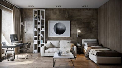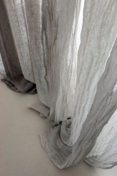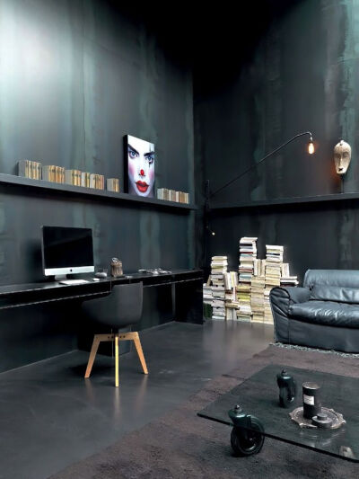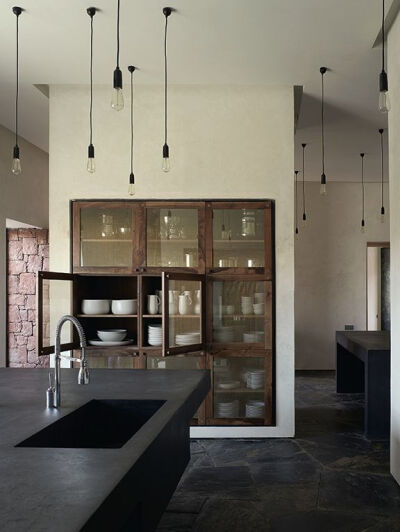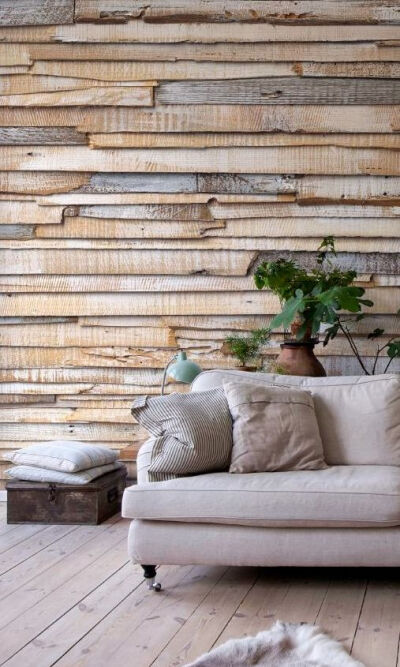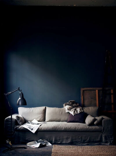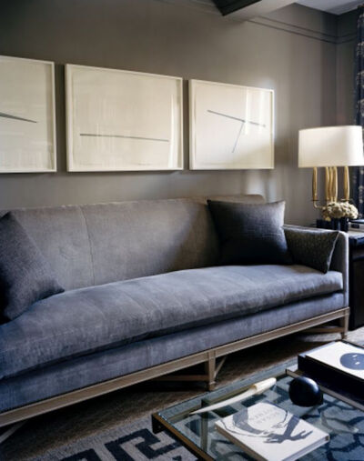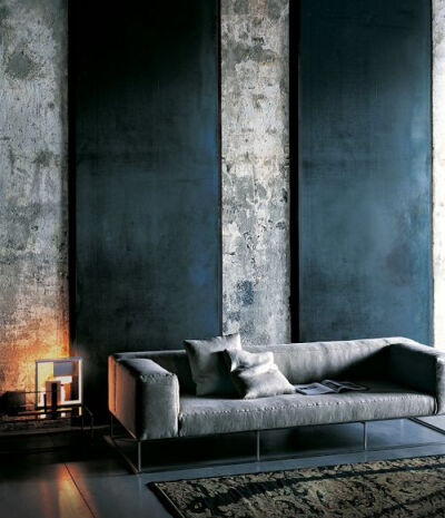
In this space from architect Pavel Vetrov, we move away from the grays into the more brown and coppery neutral tones. The walls in this home are done in varying textures, which makes the space feel quite modern, while creamy white furnishings complete the look.:
0
0
-

--Up---
收集到 omeH · ifeL … -
图片评论
0条
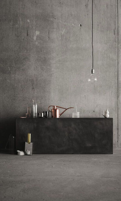
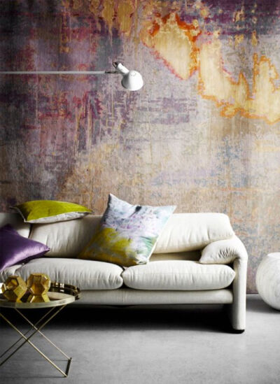
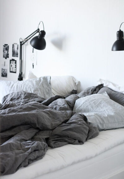
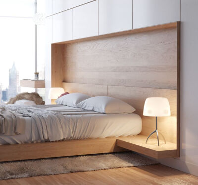
contrate texture brutes vs textures douillettes et sophistiquées:
0
2
-

--Up---
收集到 omeH · ifeL … -
图片评论
0条
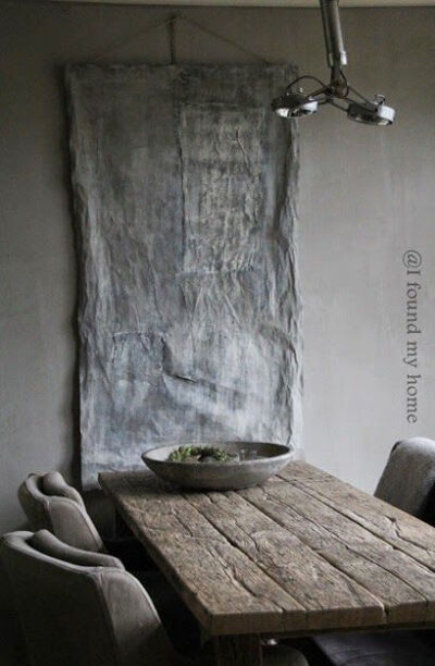
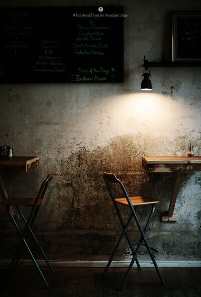
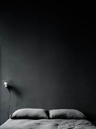
just love that wall in the background! earthy and calming colors.. and the texture! wonder how that could be recreated...:
0
1
-

--Up---
收集到 omeH · ifeL … -
图片评论
0条
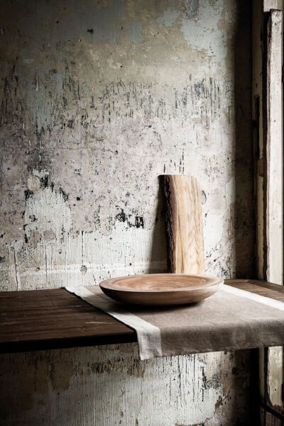
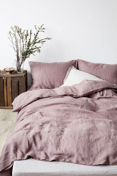
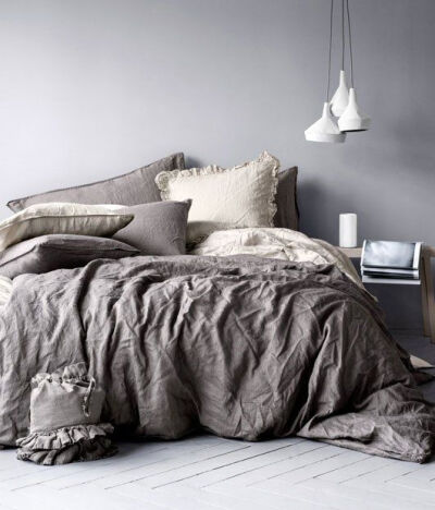
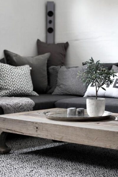
linen-bedding | H. This just screams comfort to me. Love the gray scale and the bedding looks like that perfect "cold" feeling blankets I love:
0
0
-

--Up---
收集到 omeH · ifeL … -
图片评论
0条
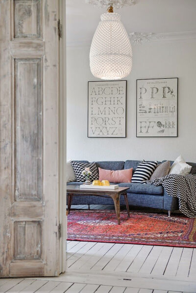
One Swedish apartment, two different ways of doing grey. Fastighetsbyrån.
0
5
-

--Up---
收集到 omeH · ifeL … -
图片评论
0条

 评论
评论


